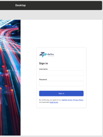
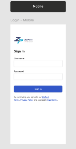
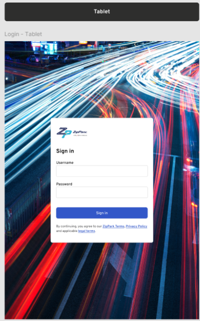
Login #
Users access Zip Park Admin with credentials provided by an admin. Available features and menus vary by user role. For more details, see ZipPark Portal: Users
Top Bar #
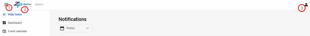
- App switcher icon: This icon is positioned in the top-left corner of the navigation bar. It opens a menu or drawer that allows users to quickly switch between different applications or modules within the platform.
- ZipPark logo: The ZipPark logo is prominently displayed in the top navigation bar, adjacent to the App Switcher icon. It serves as a visual anchor for brand identity and provides an intuitive navigation point for users.
- Profile icon: The profile icon is located in the top-right corner of the navigation bar and represents the current logged-in user. Clicking this icon reveals a dropdown menu with user-specific options.
- When clicked, it shows the Menu contents:
- User’s Full Name: Displayed at the top of the menu in “First Last” format for easy identification.
- Sign Out Option: Allows the user to securely log out of their session.
- When clicked, it shows the Menu contents:
Navigation Menu #
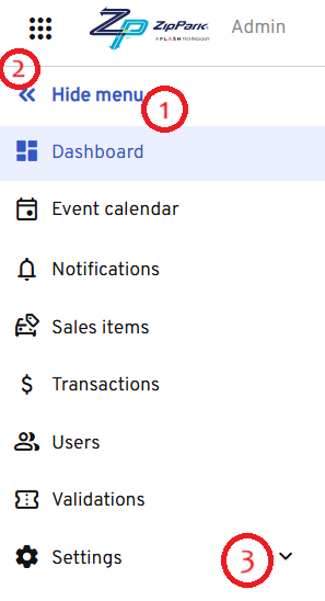
- Allow hiding the menu: The navigation menu should support a collapsible/expandable state, allowing users to hide it when they need more screen space or a cleaner interface.
- On sign-in, display menu in expanded state: When a user signs in, the navigation menu will default to its expanded state to improve discoverability and guide the user through the available sections.
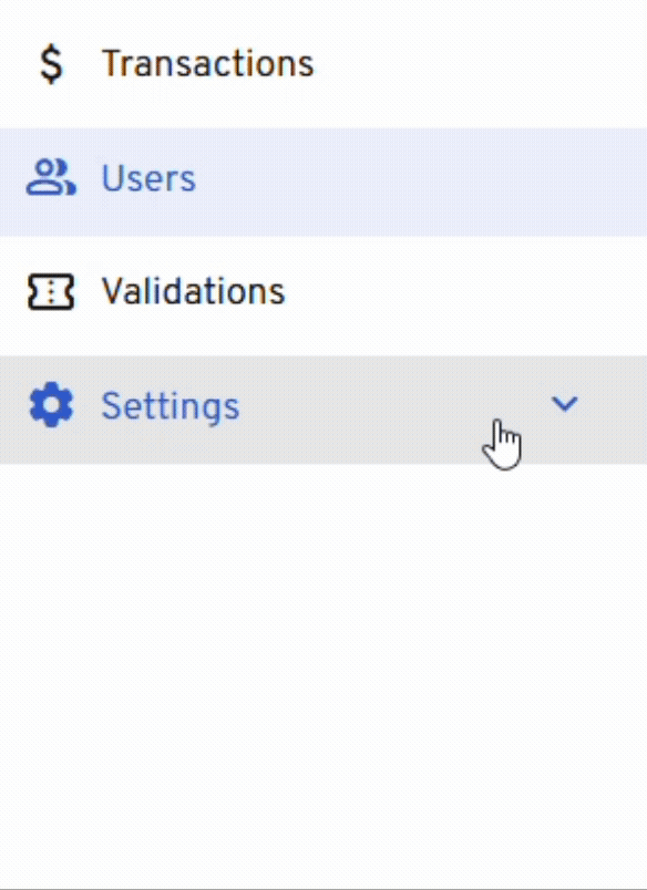
- Clicking an option with a sub-menu displays the sub-menu and changes the down-facing chevron to an up-facing chevron: If a navigation menu item has nested sub-menu options, clicking the parent item should reveal the sub-menu items below it and visually indicate this state change.
Note
All navigation menu items follow the defined visual styles for hover and selected states.